

The Data Merge feature of InDesign is great for merging text, but cannot take the text and parse it into a graph or a chart. This feature may be available through plug-ins purchased separately to Creative Suite/Cloud, but having the ability to create data merge projects that feature variable graphs or charts using only InDesign would be welcomed by many users.
In 2011, this site provided a proof of principle that pie charts and bar graphs could in fact be created via InDesign, Excel and Illustrator. Those interested can see those articles here and here.
Despite proving a point, the technique had several flaws:
- The Excel files contained many formulas that were very complicated for the average user and likely to cause problems if the original database was replaced at any time;
- The appearance of the graphs were limited to the graphics created in Illustrator, meaning any changes to the appearance of the graphs were complicated;
- With the setup of the placed images used to make the charts, only one kind of graph could be merged at once.
It would be almost a year until InDesignSecrets co-host David Blatner wrote this piece concerning a solution using the FF Chartwell font created by the FontFont foundry:
Prior to this post, the FF Chartwell font had been considered as a solution but after reading David’s article, the issue was revisited. Reading the instructions for the FF Chartwell font looked promising, and the decision was made to bite the bullet and purchase the font.
Using the font (full instructions are available with the purchase of the font but can also be found here and this video here) has several advantages over my previous solutions:
- Easy to set up;
- The same data can presented using different charts in the same data merge record;
- The appearance of the chart can take advantage of GREP styles, Nested styles, and the effects dialog box;
- PDF processing time is faster with smaller size PDFs as a result.
There are some limitations that should be spelled out prior to a purchase of this font:
- Most charts represent figures from 0-100. This is fine for percentile charts such as pie, rose, ring or radar charts, but limits the use of bar and line graphs;
- While the font allows a pie graph to turn into a donut, be aware that the hole is made using a fill colour rather than being transparent;
- The data in the charts must be integers (e.g. whole numbers, no fractions) and this means rounding results up or down accordingly. For percentile charts it is also important to make sure the total of figures in the data adds up to 100.
Tweaks or hacks to further improve the charts
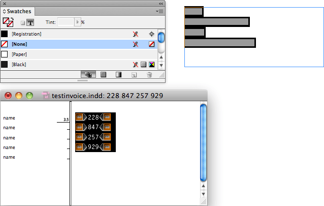
There is a bar graph that represents figures from 0-1,000; but the graph appears from left to right and starts with a diamond shape. For those wanting a usual bar chart, here is the workaround.
- Use the Chartwell bars font to represent the number between 0-1000, and format according to the Chartwell instructions; but change the fill/stroke of the font to none.

- In the paragraph palette, select paragraph rules and then select above line to the size of the text, using whatever size is felt necessary.

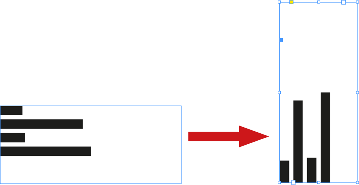
- Now that the chart displays as rectangular start/finish bars, change the rotation of the textbox that contains the chart to 90 degrees rotation.

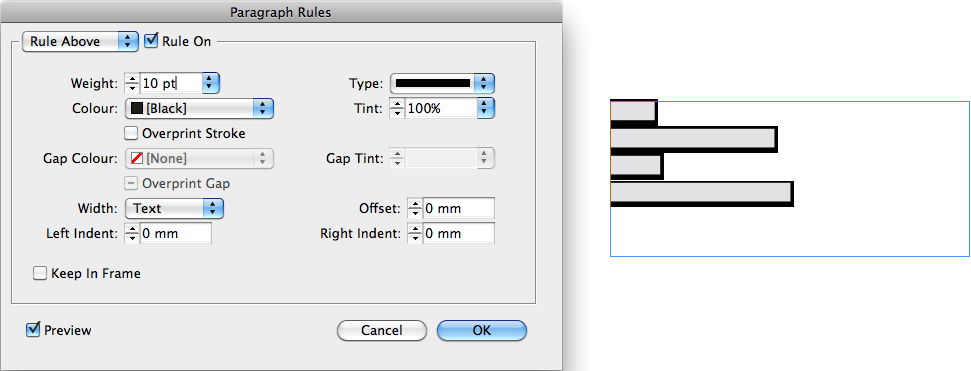
A similar solution can be used when using a segmented bar graph, but instead of using the paragraph palette, use the character palette to create individual underlines for each segment. This can be further improved upon using GREP styles.
The illustration below was a bar graph using a paragraph style that had both above and below strokes, and the bottom has been clipped by putting the text box into its own frame.
To make a piechart have a true donut hole rather than a solid circular fill (as shown in the picture below) follow these steps:
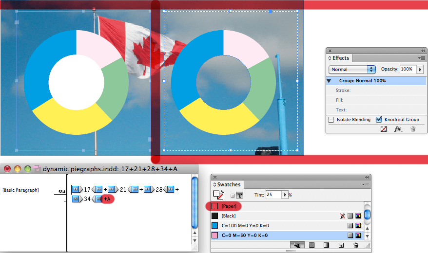
- Draw a circle the size of the desired hole and place it where the hole has to appear in the pie chart. Give this hole a paper fill and using the effects palette, set the opacity to 0%
- Select both the drawn circle and textbox that contains the pie chart and group them
- From the effects palette, check the checkbox that says “Knockout Group”
[…] ← Data Merging Charts and Graphs with FF Chartwell […]